Spendusa Damon Iusta Felix Mus Menander DLV

SPQR BLUES Chapter V

After the Volcano
  • ABOUT
  • DRAMATIS PERSONAE
  • CHAPTER I
  • CHAPTER II
  • CHAPTER III
  • CHAPTER IV
  • CHAPTER V
  • EXTRAS
  • CONTACT
  • DW
  • Français
  • Test arrrchive
  • FIBDA
Support SPQR Blues on Patreon!

Recent Posts

  • Beware. Watch this space. No, really. Really this time. No, really.
  • Have some out-of-control hair while you wait…
  • Almost yet another year
  • Head study: Domitia Longina
  • Head study: Domitian

Recent Comments

  • Typeminer on Chapter V: CI (with LXXXXVIIII, part 2, as a lead in)
  • klio on Chapter V: CI (with LXXXXVIIII, part 2, as a lead in)
  • CJG on Chapter V: CI (with LXXXXVIIII, part 2, as a lead in)
  • klio on Chapter V: CI (with LXXXXVIIII, part 2, as a lead in)
  • CJL on Chapter V: CI (with LXXXXVIIII, part 2, as a lead in)

Categories

  • blog
  • do art wrong
  • inspiration
  • sketch of the day
  • Uncategorized

Tags

10kd ancient palette blog colour digital ETA head studies hobonichi insomnia pen geekery recommendations sotd-201707 Sunday tempera watercolour work in progress
November 2025
S M T W T F S
 1
2345678
9101112131415
16171819202122
23242526272829
30  
« Mar    

Meta

  • Log in
  • Entries feed
  • Comments feed
  • WordPress.org

Do Art Wrong: Grumpy Tuesday

by klio on 17 January 2017 at 2:00 pm
Posted In: blog, do art wrong

UPDATE: At the bottom of this post, I mention that my Stillman & Birn Delta pocket sketchbook cracked and tore at each signature as soon as I opened it to those pages. It was suggested I contact the company, since apparently there’d been a defective run of sketchbooks, and some stores didn’t return their stock when it was recalled. The Sillman & Birn customer service rep sent out a replacement and a Gamma sketchbook to try. I’ll try them both over the weekend and report.

And now, back to the old post:

Today is the last of my 5-day reprieve from counting the days of the month for 8-9 hours a day (literally, not figuratively–I’m proofreading calendars. Go ahead, ask me what day of the week Waitangi Day 2018 is and when all the Queen’s Birthdays are). I should be being productive today, should mail out bill payments, finish other freelancing. But instead I’m being unproductive. I’m eating dark chocolate with oranges and almonds and playing with art stuff ^_^

Since I spend so many waking hours away from the house, I’ve been carrying my art supplies with me everywhere. The bare minimum gear is an 11×17 or 11×14 drawing pad for the comic, a notebook to work out plot and dialogue, a metal ruler, and a pen roll like this one or one of these. But also I like to take along a sketchbook for doodles and warmups, a roll of colour pencils, the Hobonichi I’d otherwise forget I have, my Peerless palette, and maybe some Copics. Now that I’ve been digging out the old-school watercolours too, the bag is getting crowded and heavy and people are giving it the side-eye. And I keep losing my wallet and Metrocard in there and missing the train.

Many days I end up with no time for drawing unless I break out the supplies while commuting. Big palettes are unwieldy when everyone’s elbows and knees are poking into everyone else’s. At the office where I freelance, it’s a little conspicuous to pull out a big metal tin of fancy paints, especially at a company that deals with so many lovely art books and clever craft books (and pretty calendars); it’s intimidating and looks weird. I’m not sure I can handle being stared at on the train, but I wanted to find a way to be inconspicuous during lunch break or curled into a corner at the nearest Starbucks. It would also be helpful to have more compact supplies to fit into the art space at Carmine Street Comics.

A lot of people buy or make mini travel palettes for their plein air painting and urban sketchbooking. I have the usual thousand empty Altoid tins lying around in various corners of the house, so I gave it a try:

Ingredients:

  • Altoids tin that still smells like cinnamon
  • adhesive applicator I picked up a couple of years ago for the Hobonichi, to stick the pans in place
  • variety of empty half pans scavenged from cheap paint sets acquired to use at children’s workshops–plus some sturdy Schmincke pans that turn out to fit better
  • Artist Trading Card in a plastic sleeve cut down to fit the lid, as a mixing area; some people add a coat of enamel to the lid but I decided to try to make this kit from only whatever was within arm’s reach because of 1. the challenge, and 2. not really a challenge, all my junk is crowded into a small space that I sorta huddle in the middle of, and 3. if the tin rusts I have about 50,000 other empty Altoids tins lying around
  • little ceramic water dish from one of those cheap paint sets; I prefer ceramic to mixing on plastic or enamel-metal palettes, which sometimes have to be abraded so the paint doesn’t bead up, and often stain
  • a silly little bit of sponge and/or folded up kitchen paper towel for cleaning the brush (a square sponge should be just the ticket)


To get the lid to snap closed on each side with the mixing dish inside, I’ll have to swap in slightly less tall Schmincke pans like the ones in the top row. For now, I don’t mind using a hair tie to make sure it stays closed. That also conveniently holds the water brush.

Although Stillman & Birn sketchbooks were recommended–for good paper and for a reputation for being able to open flat or even bend back without a problem–and the pocket size is just right to go along with a mini-palette, the Delta sketchbook cracked and ripped at the gluing between signatures as soon as I opened to the page, as you can see below. I still have have an unused Stillman & Birn Alpha pocket sketchbook, which I’ll at least give a try, but unless the Alpha books are constructed differently, a brand that can’t withstand sketching on the couch is a fail for sketching on the go.

Good thing I have three drawers full of blank or nearly blank sketchbooks to try….
 

└ Tags: pen geekery
2 Comments

DO ART WRONG: Artist’s (Watercolour Paper) Block

by klio on 2 January 2017 at 3:00 pm
Posted In: blog, do art wrong, sketch of the day

Edepol! The cover’s been creased and its perfection ruined! How will I bear to look at it now?

Like a lot of artists and writers, I have trouble with a blank page. Sometimes, that blank page is a beautiful, perfect sketchbook, an actual physical object I might ruin. I find having a new sketchbook to be encouraging at first–this or that paper or shape or size or heft looks inspiring, or the brand was recommended, or it was a gift…Then the sketchbooks lie in the art drawer for years. I don’t have a nice little sitting room or atelier where I can display their prettiness to visitors, so the books stay unseen (plus I don’t actually have visitors). Say someone asks whether I’ve used the gorgeous, lovingly selected drawing journal they gave me–I try to find a way not to say outright that, well, I did a little bitty drawing on the first page and the drawing wasn’t worthy of the journal’s beauty so I was too hesitant to sully more of the book’s pristine perfection with imperfect nonsense.

Therefore, I have a lot of empty sketchbooks. Many of them are made for watercolour, which I used to do a whole lot more of than line art but have kinda sorta forgotten how to do now. As it happens, I have a lot of watercolour paints. Last week/month/year I went to the art store for comicking supplies and saw there was a 50%-off inventory-clearance sale (old-formula-pigment Quinacridone yellow to be had for less than the day’s coffee and morning cinnamon danish? I mean, who can say no to old-formula-pigment Quinacrindone yellow, amirite). But I realised that if I bought it, that too would go in the drawer with the supplies that aren’t used up because I’m always, always afraid to DO ART WRONG.

So, to get past this, I assigned the sketchbooks a purpose: In January, once a day, I’ll do variations of a subject in each of several sketchbooks; and not as an end in itself, not trying to do the Arting right, but to a technical and practical use–to determine the paper that best suits investing in more of the same. For the time when I might want to do a real sketch journal or go out for some for reals urban sketching or really use those fancy-palette watercolours in the way they deserve. It’s not that I’m messing up sketchbook pages so they won’t be inspiring carnets for others to see. This is specifically the task of figuring out which paper I like best. I’m trying spiral bound pads, and those economy watercolour paper blocks that are glued down on the sides and give you mad deep papercuts when you loosen a sheet, and softcover sketchbooks that come several to the shrink-wrapped package, and hardbound journals like what those urban sketchers use, and if the art is so-so–or so, so bad–so what. That’s not what this is for. This purpose does not include “BE PERFECT” anywhere in the description.

The sketchbooks, at least, have found a meaning in life for 2017.

Yesterday I only used Sennelier paints, plus that of Daniel Smith Quinacridone Gold. This is on Cotman Montval 300gsm cold press paper:

Things I don’t plan to fret about just at the moment: perfect uniform details; perfect body proportions; perfect use of colour; colour theory (don’t get me started; at least, not in this post). The sloppiness isn’t bothering me at all, nope nope nope. I do need to care about skin tone–this particular paint sometimes dries paler than I’d expect, but I wanted to scan the drawing before I go back in with another glaze to fix Felix’s pallor. Maybe adding a layer will mess up the drawing, but, hey, that doesn’t bother me, nopey nope nopers, not at all I tell you.

On Arches 300gsm cold press watercolour pad, not going to get fussed about the wacky skin tone tests here either:

Pencils with washes, paint over waterproof ink, seeing how that works on the Arches paper:

This paper–Fluid 4×6-inch “Easy Block” cold press–I’ve deemed inexpensive enough to use for itty bitty test sketches and mixing and layering tests. Do I care that the sketch is completely wonky no of course I do not ha ha ha it’s fine no really i am ok with this:

Next test piece in progress in a Strathmore 400 series 300gsm watercolour sketchbook:

Semi-Related Recommendation: If you love the love of history and archaeology and discovery, and are in the mood for a quietly (and sometimes outrageously) funny comedy, try Detectorists, created by actor/writer/director Mackenzie Crook (The Office, Pirates of the Caribbean). It’s available in the US on Netflix. It gave me all the feels there are. It made me want to stick with something I love, even if it breaks my heart sometimes, even if it means ruining a perfect sketchbook cover. @detectorists

└ Tags: recommendations, watercolour
2 Comments

pen geekery: Utrecht pencils

by klio on 25 December 2016 at 8:00 pm
Posted In: blog
All the pencils (that I can find at the moment)

All the pencils (that I can find at the moment)

This little red Utrecht dot took me by surprise.

This little red Utrecht dot took me by surprise.

I recently found a lone, out-of-place carmine red Utrecht pencil in one of my Niji pencil rolls with the fancy Polychromos, Luminance (touted for their lightfastness), and Pablo pencils. I’m sure I put the red pencil aside at some point when I was looking for a good proofreading markup pencil, after finding the Pilot Color Eno pencil lead to be much too faint and waxy, and before discovering the Mitsubishi Erasable vermilion pencils (a little soft and smeary, but writes over a lot of laser-printer inks) and an old Sanford Col-Erase carmine red that belongs to the desk at the office where I freelance; both of those are perfect for the current gig of marking up endless, endless (endless, oh jove, endless) printouts. The Utrecht pencil surprised me with how nicely it draws and how nice it feels to use when compared to the “superior” pencils. A little hard, but not scratchy. Since I like a little control, rather than a very soft line, I felt like I’d found a bowl of just-right porridge.

I gathered all the colour pencils I could find in the art drawers and arranged them by brand. Now there are Niji rolls everywhere. (I’ve given up the dream of having a home with a room just for arting and art supplies where they can be laid out on work tables and readily to hand, instead of crammed into drawers in a corner, but maybe for the next few days I can get away with calling the unrolled rolls holiday decorations. Maybe if I string lights on them.)

This post will be about the dry pencils only. I’ll get back around to the watercolour pencils later.

Utrecht Light Orange pencil core with a patch of yellow. That's odd, right?

Utrecht Light Orange pencil core with a patch of yellow. That’s odd, right?

Utrechts as a brand name have been discontinued–they’ve been rebranded under the Blick name, though they’re purported to be manufactured still at the same Koh-I-Noor pencil plant in Czech Republic (the same plant where some of my antique pencils were made). The Utrechts can be found in open stock at Dick Blick stores, but they’re running out.

The verdict is still out on whether the Blick-branded pencils are the same as the Utrechts, and I don’t have a set of Blick pencils to compare. I do have the Blick blender, and I can definitely say that the Blick blender pencil was not as good as the Utrecht blender. The Blick was scratchy and did a mediocre job of it; the Utrecht, though presumably older stock, created a smoother blend. The Blick blender was equally as scratchy as the Caran d’Ache Full Blender pencil–which costs considerably more, crumbles into flaky bits, and overall has turned out to be a disappointment.

Utrecht/Blick pencils can be had for as low as 85 cents each, as opposed to US$3-$6 for the high-end pencils. At that price, the next time I’m downtown I can nab a few Blicks to compare to the Utrechts. If the Blicks hold up, they’re a reasonable budget pencil; you won’t have to feel twitchy about using them down to a nub.

SIDE NOTE: A reasonably priced brand that I’ve had trouble with lately is Prismacolor.
Some online reviewers say that new formulation has made the cores brittle, and substandard casing makes them difficult to sharpen. I’ve experienced that myself, until I just gave up on two Prismacolors at the halfway point, as I couldn’t get them to sharpen without constant breakage and splintering of the case. They seem to hold up until anything disruptive happens, such as dropping a pencil, or simply using it a lot.

These are the Utrechts:

pengeekery_20161225_utrecht

And a little Damon scribble to try out a pale skin tone, just scribbled, not burnished to evenly smooth (the chin isn’t quite his):

pengeekery_20161225_damon_utrecht

The quality, ease of use, and waxiness vary from colour to colour. They wouldn’t be my first choice in brand–Polychromos probably wins–but they’re not so bad, they sharpen well, the points don’t wear down quickly. I managed to do a decent drawing of Iusta with them on plain Moleskine paper. They erase without a fight.

The assortment of colours I have in each brand is a bit random, rather than a thought-out palette. The easiest to use were the Faber-Castell Polychromos; I scribbled a little column in a garden, and that was that. I felt like I had to fuss with the Caran d’Ache Pablos until I’d overworked the image, then tried again, and fussed again. Polychromos and Pablo are oil-based pencils; the Caran d’Ache Luminance and Utrecht are wax-based. Some of the columns are a little tipsy.

(click on any of these images to see them larger)

pengeekery_20161225_luminance
pengeekery_20161225_cols

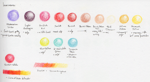
Overall thoughts? I want to love the Luminance the most, for their vivid hues and lightfastness, but the Polychromos behave the best, have a nice smoothness to them that I appreciate. When I’m just doodling, playing with concepts or scribbling something I’ll later toss out, the Utrechts are a great option. I’ve been known to be up all night with insomnia and Netflix, drawing ideas and poses and wonky stuff that isn’t worth keeping. I fret about using up supplies, but I don’t have to tie myself in knots about using up or misplacing an inexpensive pencil; and it’s an inexpensive pencil that isn’t frustratingly waxy or hard to blend. Maybe it’s because pencil isn’t my primary medium, so I’m a little less exacting, but Utrechts don’t make me feel like I’m wasting energy not going right to top-of-the-line materials to doodle in a notebook.

└ Tags: pen geekery
Comments Off on pen geekery: Utrecht pencils

Sketch of the day: After party

by klio on 15 December 2016 at 8:11 pm
Posted In: sketch of the day

A doodle with random pencils while hanging around after the holiday party at the freelance job….

Utrecht pencil doodle

Comments Off on Sketch of the day: After party

LXVI: Not-safe-for-Work in Progress

by klio on 11 December 2016 at 12:00 pm
Posted In: sketch of the day

spqrblues_20161210_wipA few days ago I rejected a comic in progress because the anatomy was off (arms all over the place), but since I’d already thumbnailed it out, I’ve decided to finish it. I was experimenting again with layout, and I’d like to follow through on the idea.

Here it is in thumbnails-and-sketches form; click pic to see the whole thing. NSFW for bare bottoms, female chests without nipples, suggestive balloon tail placement, and “what are those hands doing outside the panel borders?” I could make it completely SFW and tame, but this isn’t an all-ages comic and, as I frequently pontificate, it wouldn’t be an issue if the images were merely battlefield slaughter and bloody assassinations. It’s also probably NSFW for being on the topic of “three portraits of using sex to get someone’s attention.” This would work as the alt tag.

The final version will be a wee bit censored, and there will be some tweaks to the balloon placement/flow. I’d have posted this WIP as a bonus on Patreon, where I don’t feel as concerned about little kids meandering by, but I’m still waiting on follow-up from Patreon tech support on technical issues.

└ Tags: work in progress
Comments Off on LXVI: Not-safe-for-Work in Progress
  • Page 10 of 15
  • « First
  • «
  • 8
  • 9
  • 10
  • 11
  • 12
  • »
  • Last »

An illustrated science fiction novel by Alitha Martinez

Check out The Roman View, an alternate-history Roman blog, and its sequel Titans' Travels


©2016-2024 SPQR BLUES Chapter V | Powered by WordPress with ComicPress | Subscribe: RSS | Back to Top ↑