
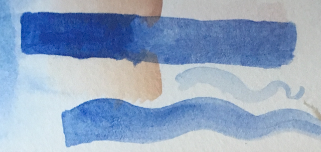
Lapis Lazuli swatches on the right, modern Ultramarine swatch on the left.
I’ve been playing with Lapis Lazuli blue in my ancient palette since I acquired a small amount of powdered pigment, supposedly from the same source the Romans (and later painters) used. It’s not the super-expensive super-high quality called Fra Angelico Blue, but even a medium-nice grade can be 40 times the cost of, say, red ochre (which, to be fair, is basically dirt).

unsuccessful Egyptian Blue paint (over black ink). It’s basically just sand barely adhered to the page.
Maybe because of this, I was very careful when mixing my ten bucks worth of pigment into paint, and my first attempt turned out very well. Much more highly pigmented than, say, the
Daniel Smith brand Lapis Lazuli Genuine watercolour. The picture doesn’t fully do it justice. There’s something about it that sets it apart from the modern synthetic version of Ultramarine (Lapis Lazuli was also originally called Ultramarine, “from across the sea,” since the stones for it were imported). My Lapis Lazuli paint was much more successful than my attempts at getting Egyptian Frit Blue (considered the first synthetic pigment) to work in watercolour.

The darker blue here is the concentrated version (layered over some stray washes, but hopefully you get a sense of it).
Over the weekend I took a few hours break from work to experiment with the Lapis Lazuli paint left in the mixing cup when I made the first small batch of paint. Waste not, want not–my initial intention was just to get the paint out of the cup to use. It’s not quite the Fra Angelico extraction method, and I’m starting with a lower grade of pigment, but I was able to precipitate out different grades of pigment particles and get a more concentrated version in the paint binder.
I’m a novice at making paint, whether watercolour, tempera, or encaustic. Who knows whether I’m filtering out the impurities or just making a mess. But I like the result.


Recent Comments