Spendusa Damon Iusta Felix Mus Menander DLV

SPQR BLUES Chapter V

After the Volcano
  • ABOUT
  • DRAMATIS PERSONAE
  • CHAPTER I
  • CHAPTER II
  • CHAPTER III
  • CHAPTER IV
  • CHAPTER V
  • EXTRAS
  • CONTACT
  • DW
  • Français
  • Test arrrchive
  • FIBDA
Support SPQR Blues on Patreon!

Recent Posts

  • Beware. Watch this space. No, really. Really this time. No, really.
  • Have some out-of-control hair while you wait…
  • Almost yet another year
  • Head study: Domitia Longina
  • Head study: Domitian

Recent Comments

  • klio on Chapter V: CI (with LXXXXVIIII, part 2, as a lead in)
  • FDChief on Chapter V: CI (with LXXXXVIIII, part 2, as a lead in)
  • Jenny on Chapter V: CI (with LXXXXVIIII, part 2, as a lead in)
  • Jerry B. on Beware. Watch this space. No, really. Really this time. No, really.
  • Jerry B. on Beware. Watch this space. No, really. Really this time. No, really.

Categories

  • blog
  • do art wrong
  • inspiration
  • sketch of the day
  • Uncategorized

Tags

10kd ancient palette blog colour digital ETA head studies hobonichi insomnia pen geekery recommendations sotd-201707 Sunday tempera watercolour work in progress
May 2025
S M T W T F S
 123
45678910
11121314151617
18192021222324
25262728293031
« Mar    

Meta

  • Log in
  • Entries feed
  • Comments feed
  • WordPress.org

Sketch of the day: daily watercolour #3

by klio on 5 July 2017 at 12:01 am
Posted In: sketch of the day

This is another paper made by St Cuthberts Mill, called Bockingford. It’s 140lb cold press, like the Millford paper, though it feels ever so slightly stiffer, and the texture is ever so slightly rougher. When doused with the same amount of water as I put on the Millford, it warped and didn’t dry back flat on its own like the Millford–but it flattened out after I forgot it in the scanner for a while. Layering on this paper is easier; I’ve been adding layer after layer on the skin tone, and not only didn’t accidentally scrub off the previous layers of paint (as with the Millford), but see no damage to the paper.

The manufacturer says: “traditionally made on a cylinder mould machine…surface is created using natural woollen felts that give it a distinctive random texture. Appreciated for its excellent colour lifting abilities. This is an extremely forgiving watercolour paper.”

└ Tags: sotd-201707
1 Comment

Sketch of the day: daily watercolour #2

by klio on 4 July 2017 at 12:01 am
Posted In: sketch of the day

Today’s paper is Daler-Rowney’s Langton Prestige, 140lb/300gsm cold press/”not.”

I didn’t like it all that much. This drawing incorporates homemade paints, Indigo, Japanese-style Kuretake Gansai Tambi paint (did not play well with the paper), and various commercial-brand watercolours (Sennelier, M Graham, MaimeriBlu, & Daniel Smith). The paper holds up perfectly fine to lots of water (which seems to dry oddly quickly), to lifting/scrubbing off paint, and layering. I think the various paints look a bit lifeless, in a way that’s hard to quantify.

└ Tags: sotd-201707
Comments Off on Sketch of the day: daily watercolour #2

Sketch of the day: daily watercolour

by klio on 3 July 2017 at 2:31 pm
Posted In: sketch of the day

I have at least 30 (possibly more) different types of watercolour sampler papers that I’d like to test, so I’m going to try to do a little piece of art each day–maybe during lunch breaks, so I can make sure I do them quickly, not worrying about the drawing details. Or worrying about, you know, anatomy and stuff.

Also of course I’m going to try to keep the comic chugging along.

Today’s “spend no more than an hour on it this time” test of the paper samples stars St. Cuthberts Mill Milford 140lb cotton cold press (“not”) paper.

click to see larger

Light pencil erases easily; paints lift well; the paper warps when wet but dries flat; and I discovered I need to learn PATIENCE before layering on this type of paper–it doesn’t dry immediately, but stays workable for a while, so I found myself accidentally scrubbing off the underlayer of paint.

I was also being my usual timid self, and the colours looked a bit washed out. I think more (patient) layering would give a much more vivid result, judging by how bright the more pigment-dense paints along the side look when thumped on the paper in masstone (in “full strength,” so to speak).

According to the manufacturer:

Millford is the newest watercolour paper developed by St Cuthberts Mill. It is styled on the discontinued Whatman watercolour paper….It is mould made from 100% cotton (just like the original Whatman), and its beautiful surface is created using natural woollen felts. It is deliberately created to have a high resistance to water, so its washes perform very differently to traditional watercolour papers.

└ Tags: sotd-201707
2 Comments

ICYMI: Iusta in another new dress & Damon’s Little Helper

by klio on 13 June 2017 at 11:00 pm
Posted In: sketch of the day

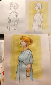
Posted on Twitter today: I played with a sampler of QoR watercolours today (instead of getting the next comic done–but it was something I could do while thinking through the next complicated(!) steps in the plot).

QoR paints are made with a synthetic substitute for gum arabic, a binder traditionally used in watercolours and mostly sourced from one type of acacia tree in Sudan. I’ve heard that the synthetic binder is used in art preservation, but that disqualifies QoR paints from joining my ancient palette, even as a substitute for something poisonous 🙂 The paints needed some finessing to work nicely on the sketchbook paper. They wouldn’t be my first choice of paints, but some artists like them. I’ll keep playing with them until my tiny sampler runs out.

These are photos, not scans, so the colours and proportions are slightly different in each Iusta image.

(click ’em to see larger)

7 Comments

Do Art Wrong: dip pens & markers

by klio on 11 June 2017 at 4:00 pm
Posted In: do art wrong

Today’s warmup features antique & new dip pens; J. Herbin’s archival black ink Encre Authentique (said to have been used by all the classiest ye olde French notaries); a variety of Rohrer & Klingner inks (the two iron-gall inks are not waterproof, the overenthusiastic burnt sienna is); and Copic markers, which I admit is a very weird combination of materials.

I grumped about the black ink not working with one of the nibs, but eventually got it going. The Copics sopped right through Stillman & Birn Alpha paper, but they blended reasonably nicely.

Comments Off on Do Art Wrong: dip pens & markers
  • Page 5 of 15
  • « First
  • «
  • 3
  • 4
  • 5
  • 6
  • 7
  • »
  • Last »

An illustrated science fiction novel by Alitha Martinez

Check out The Roman View, an alternate-history Roman blog, and its sequel Titans' Travels


©2016-2024 SPQR BLUES Chapter V | Powered by WordPress with ComicPress | Subscribe: RSS | Back to Top ↑