Chapter V: CI (with LXXXXVIIII, part 2, as a lead in)
on 8 July 2021
at 11:30 pm
71 Comments
 |
 |
 |
 |
 |
 |
 |
")

Seems like an appropriate day every year to peek back out from under the rubble and see if accounts and websites are still working.
So.
How are all of you doing?
If I can’t get any sleep, at least one of these Romans will.
The next three comics are written and sketched. Now to find the time to clean them up and ink them! I’d have more time if my drawing warmup exercises didn’t keep turning into “draw every strand of hair.”

Hello, everyone! I would have loved to post one more bit of story before the year’s end, but with only hours to go, that’s highly unlikely. Most of my time, since early summer, has had to go to family things and freelancing, though I did manage to draw a bunch of mega-size animals for a project along the way. I have so many ideas for the story of our Romans to continue—history gets pretty wild right around now in Felix’s life. Maybe in 2020, he’ll get to tell us more of his story.
Happy New Year to you all!
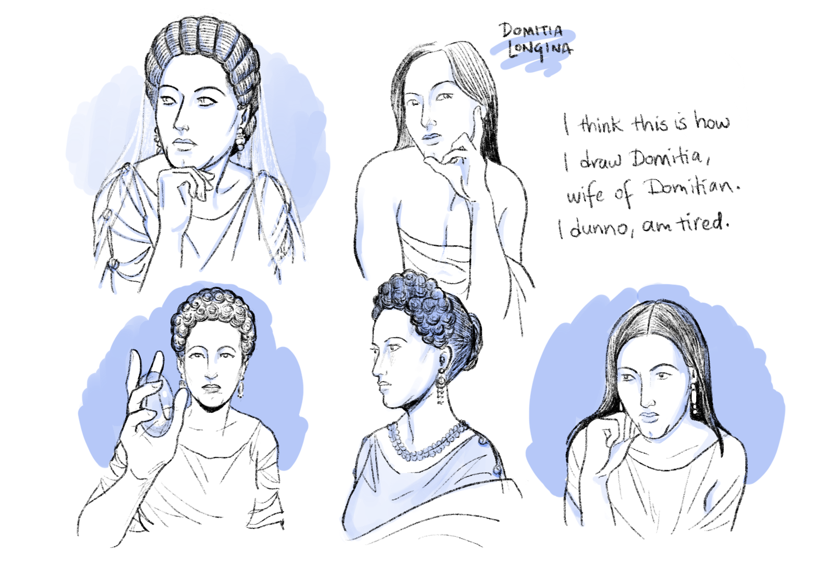
Domitia Longina is overdue for getting up to some plotting.


Recent Comments